In 2026, FAQ pages play a much bigger role than simply answering common questions. They shape how customers discover your brand, evaluate trust, and decide whether to move forward. People search in questions, expect instant clarity, and prefer self-service before reaching out to support. At the same time, search engines, voice assistants, and AI tools rely heavily on structured Q and A content.
This guide showcases 25 real-world FAQ templates from leading eCommerce brands, SaaS platforms, and enterprises. It also includes practical SEO and UX best practices to help you reduce support tickets, improve visibility, and guide users with confidence.
- FAQ pages in 2026 function as discovery, trust, and conversion assets simultaneously.
Beyond answering questions, well-structured FAQs capture search traffic, qualify buyer intent, and reduce the friction that prevents first purchases.
- Search engines and AI tools rely heavily on structured Q&A content for featured snippets and voice answers.
FAQ pages marked up with schema and organized around natural question phrasing have a significant advantage in appearing as zero-click search results.
- Twenty-five real-world templates drawn from e-commerce, SaaS, and enterprise brands cover the widest use case range.
Using proven structures rather than building from scratch ensures the FAQ addresses the questions customers actually ask rather than those the team assumes they ask.
- UX design of the FAQ page determines whether customers find answers or abandon and contact support.
Accordion layouts, search bars, and category groupings allow fast self-service navigation; walls of text buried on a single page produce high exit rates.
- Reducing support tickets is the primary operational ROI of a well-maintained FAQ page.
Each FAQ that successfully deflects a support contact saves the cost of agent time while simultaneously delivering a faster answer than any human handoff could provide.
What is an FAQ page?

An FAQ page, or Frequently Asked Questions page, is a dedicated section of a website that provides clear answers to common customer questions. Its main role is to help users quickly understand a product, service, or process without contacting customer support.
A good FAQ page focuses on practical topics that matter to users, such as pricing, account setup, shipping policies, returns, and basic troubleshooting. Answers should be written in simple language and kept concise so readers can scan the page and find what they need in seconds.
For businesses, an effective FAQ page reduces repetitive support inquiries and improves efficiency. For users, it offers a self-service solution that saves time, reduces frustration, and builds confidence before they make a decision or complete an action.
Why FAQ templates are critical for modern websites and support teams

FAQ templates play a key role in how modern users look for information and how businesses deliver support at scale. They bring structure, consistency, and clarity to answers that customers actively seek.
User behavior and search intent
Most people search in the form of questions. They type queries like, "How do I reset my password?," "What does this plan include?," or "Can I cancel anytime?" FAQ templates are designed around this behavior. By organizing content as clear questions and direct answers, you match user intent exactly. This makes it easier for visitors to scan, find answers fast, and move forward without frustration.
Business impact
Implementing well-structured FAQ templates can significantly reduce support tickets, with many businesses reporting 30–40% fewer inquiries after adding thorough FAQs. This self-service approach saves time and reduces support costs. FAQ pages also build trust with potential customers by answering concerns early, which can boost conversions.
In some cases, FAQ users convert at higher rates because they feel confident and informed. FAQs also support better onboarding and retention by helping new users find answers on their own, especially during early use.
SEO and AI search visibility
FAQ templates improve visibility in search engines by increasing the chance of appearing in featured snippets. They also support voice search, where users ask direct questions and expect concise answers.
In addition, generative AI tools rely on well-structured questions and answer content. Clear FAQ templates make it easier for AI systems to retrieve and present accurate information about your product or service.
25 real-world FAQ page templates to reference in 2026
Here are 25 real-world FAQ page templates from leading brands, showcasing modern structures built for usability, self-service, and search visibility in 2026.
E-commerce & retail FAQ examples
1. Shopify – Store help center & merchant FAQ

Shopify's FAQ help center uses a single-column accordion layout, organizing questions under lifecycle-based categories like Getting Started, Selling, Payments, and Shipping. Each question expands inline, keeping the page clean while allowing detailed answers without redirects.
The structure mirrors a merchant's journey from setup and pricing to transactions and fulfillment, making it intuitive for new users. This design reduces friction, maintains a clear hierarchy, supports step-by-step learning, and reinforces conversion with visible calls to action such as starting a free trial.
2. Amazon – Orders, shipping, returns, Prime

Amazon's FAQ layout combines a left-hand sidebar with a fully expanded content column. Instead of collapsible answers, detailed explanations appear in full, prioritizing clarity for policy-driven topics like eligibility, shipping rules, device programs, and data practices. The sidebar surfaces related help links, encouraging deeper navigation.
This structure works well for complex or compliance-heavy content, as it promotes transparency, supports thorough reading, builds trust, and ensures users can easily explore connected policies without losing contextual orientation.
3. Nike – Delivery, returns, membership

Nike follows a search-first structure anchored by a prominent "Get Help" search bar. Below it, grouped categories such as Returns, Shipping, Orders, Membership, and Payments appear in a clean multi-column grid. Each section highlights common questions with clear pathways to browse further.
The layout supports both scanning and direct searching. It prioritizes speed and task completion, aligns closely with customer purchase journeys, and helps users quickly resolve issues from checkout through post-purchase support.
4. Zappos – Returns-first FAQ experience

Zappos uses a dense single-column layout structured like an index. Bold section headers such as Returns, Payment Information, Suspicious Activity, and Technical organize a compact, numbered list of questions. Rather than expandable content, users navigate directly to answers, creating a directory-style browsing experience.
The categories cover policies, account management, and payments, reflecting broad support needs. This approach maximizes information visibility, enables fast scanning, and suits users who prefer comprehensive lists instead of layered accordion interactions.
5. Etsy – Buyer vs seller FAQ separation

Etsy separates Shopping on Etsy from Selling with Etsy through clear audience-based navigation tabs. A search bar anchors the experience, followed by featured articles arranged in a structured grid. Buyer topics focus on orders, returns, and safety, while seller content addresses ads, taxes, shipping labels, and account setup.
This separation reduces cognitive overload, keeps information relevant, and aligns support with distinct user journeys so buyers and sellers can quickly access guidance tailored to their needs.
6. Walmart – Large-scale searchable retail FAQ

Walmart's FAQ page combines tabbed navigation with a searchable accordion layout. Tabs segment content into Customers, Suppliers, Purpose, and General, filtering information by audience. Within each tab, vertically stacked questions expand inline for detailed answers. The integrated search bar allows direct query entry.
This structure works effectively at enterprise scale because it acknowledges diverse stakeholders, reduces clutter, and keeps corporate and consumer topics distinct within a centralized help environment.
7. Sephora – Loyalty, beauty returns, payments
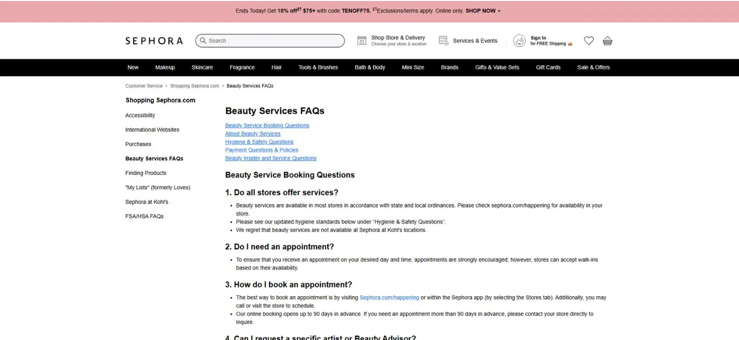
Sephora's Beauty Services FAQ uses a long-form single-page layout where all answers are fully visible in continuous scroll format. Content is grouped under headers such as Booking, Hygiene and Safety, Payment Policies, and Beauty Insider. Questions are numbered and followed by detailed explanations covering cancellations, age requirements, service rules, and sanitation standards. This format emphasizes transparency and clarity, minimizes extra clicks, and allows customers to review all policies in one place before scheduling appointments.
8. Apple Store – Product, shipping, warranty FAQs
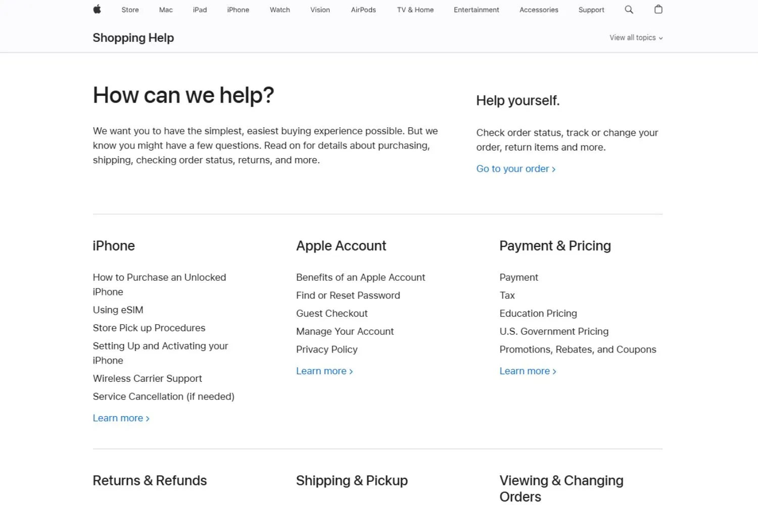
Apple's Shopping Help page uses a clean, grid-based layout that groups support topics into clear categories such as iPhone, Apple Account, Payment & Pricing, Returns & Refunds, Shipping & Pickup, and Orders. Each category links to more detailed questions and guidance, allowing users to drill down without feeling overwhelmed.
The structure emphasizes clarity and self-service, helping customers quickly find policies, order tracking, or account support. By organizing information into logical sections, Apple reduces friction and keeps the experience simple and intuitive.
9. Zara – Online orders, store pickup, refunds
Zara's FAQ page uses a structured multi-column directory layout that resembles a help hub rather than a traditional accordion.
Topics are grouped into clear, scannable sections such as My Zara Account, Items and Sizes, Gift Options, Deliveries, Payments and Invoices, Purchases, Exchanges and Returns, Zara Pre-Owned, and Zara Experiences. Each category contains concise, task-oriented links like tracking orders, managing profiles, returns, refunds, and payment security.
This design works because it mirrors real customer journeys, reduces cognitive load through logical clustering, and allows users to quickly navigate to precise answers without expanding multiple dropdowns or scrolling excessively.
10. H&M – Shipping, sizing, returns
H&M's help page uses a two-column layout with expandable FAQs on the left and category navigation on the right. The Delivery section features accordion-style questions covering shipping options, tracking, cancellations, missing parcels, incorrect items, and external brand deliveries.
Other categories, such as Payments, Returns & Refunds, Product & Size, and Membership, allow users to switch topics easily. This approach keeps the page visually clean while still offering detailed answers on demand, helping shoppers resolve issues quickly without navigating away from the help center.
11. ASOS – International delivery, customs, sizing
The ASOS Customer Care page is structured around clearly defined help categories, making it easy for shoppers to find support quickly. Topics such as Delivery, Returns & Refunds, Order Issues, Product & Stock, Payments, and Technical support are presented in card-style sections.
Each category reveals detailed FAQs when selected, covering common concerns like tracking orders, sizing help, promo codes, and account management. A search bar at the top enables quick navigation, while popular FAQs and direct contact options provide additional assistance when needed.
12. AliExpress – Buyer protection, shipping times
The AliExpress Help Center organizes support into clear FAQ categories, including Shipping & Delivery, Returns, Ordering & Payment, Coupons & Promotions, Refunds, and Account Management. Each section expands to reveal common questions, such as tracking orders, shipping timelines, seller processing times, and speeding up delivery.
The layout combines expandable menus with quick-access topic cards, making navigation straightforward. The "More questions" option guides users to additional details, while top links such as Knowledge and Privacy Policy provide access to broader platform information and policies.
13. Shein – Returns, tracking, customs
The SHEIN Help Center provides structured FAQs across key categories, including Tracking & Delivery, Policy Reference, Returns & Refunds, Processing, Payment, Account Issues, Pre-Sale, Legal/Security & Privacy, Media/CSR, and Suggestions/Disputes. Each section contains expandable questions addressing common concerns such as shipping timelines, customs fees, failed deliveries, refunds, invoices, and account management.
A search bar helps users quickly find solutions, while filter tabs like Estimated Delivery Time or Customs/Extra Duties refine results. The organized layout ensures shoppers can efficiently resolve order, policy, or payment-related issues.
14. Gymshark – Sizing, delivery, exchanges
Gymshark features a clean, card-based layout designed for quick navigation. Key categories include Orders & Delivery, Returns & Refunds, Payments & Promotions, Technical, Product, and General Information. A prominent search bar allows users to find answers instantly, while popular questions such as tracking orders, delivery details, returns, refunds, and restocks are highlighted below.
Clear calls to action, including starting a return directly from the homepage, streamline support. The structured design ensures customers can quickly resolve common order, product, or account-related inquiries.
15. Allbirds – Sustainability, care, returns
Allbirds presents FAQs in a simple, text-focused layout grouped by clear categories. Sections include Products & Fit, Returns & Exchanges, Orders, Shipping & Tracking, Payments & Refunds, and Company information. Common questions cover sizing accuracy, washability, waterproof features, gift options, shipping methods, refunds, and sustainability commitments.
A prominent search bar at the top helps users quickly locate answers. The clean structure and straightforward listing format make it easy for customers to browse topics and find support related to products, orders, policies, or brand practices.
SaaS & software FAQ examples
16. Zendesk – Ticketing, workflows, account management
Zendesk organizes comprehensive documentation into structured sections covering every part of the Zendesk ecosystem. Categories include Suite basics, Support, Guide, Messaging, Live Chat, Voice, Sell, Reporting and Analytics, Security, Account Management, AI agents, Apps and Integrations, and more. Each section contains focused articles and subsections on setup, configuration, automation, collaboration, and data protection.
The layout is grid-based and expandable, enabling users to explore detailed product documentation efficiently. This structure supports both new users evaluating Zendesk and experienced teams optimizing workflows.
17. Slack – Features, plans, security, usage
Slack features a clean, category-based layout designed to guide users quickly to relevant resources. Key sections include Getting Started, Using Slack, Profile & Preferences, Connect Tools & Automate Tasks, Workspace Administration, and Tutorials & Videos. A prominent search bar and common troubleshooting links help users resolve issues efficiently.
Each category contains structured articles covering setup, collaboration, integrations, and account management. The visual, card-style design makes navigation intuitive for both new users learning Slack and administrators managing teams at scale.
18. Dropbox – Storage, sync, billing
Dropbox presents common questions in a simple accordion layout, allowing users to expand items for detailed answers. Topics focus on team usage, storage limits, plan differences, account upgrades, migrations, collaboration features, and eligibility requirements.
It also addresses sharing between individual and team accounts, minimum user counts, and nonprofit or education discounts. The clean, minimal design keeps attention on essential information, while a clear link to the Help Center provides access to more comprehensive documentation and support resources when needed.
19. HubSpot – CRM, onboarding, pricing
HubSpot centers on a prominent search bar under a clear "How can we help?" headline, encouraging users to begin with a search. Below, the content is organized into visually distinct cards that guide different user needs, including community discussions, how-to articles, training courses, developer documentation, customer stories, and certified partners.
This structure supports both self-service learning and deeper product exploration. By separating educational resources from peer support and technical documentation, the page provides a cohesive, easy-to-scan interface for beginners, advanced users, and developers.
20. Notion – Workspace setup, collaboration, permissions
Notion combines a left-hand documentation sidebar with a central, search-led layout that prioritizes discovery. A prominent search bar and quick topic chips, such as billing, data sources, and restoring content, guide users toward common tasks immediately.
Below, popular topics are presented as icon-based cards covering getting started, Notion AI, databases, media, collaboration, and workspace roles. The persistent sidebar lists detailed reference sections, from pages and blocks to security and integrations. This layered structure supports both quick answers and deep documentation browsing without overwhelming users.
Enterprise & service FAQ examples
21. Salesforce – Cloud products, licensing, security
Salesforce's FAQ page for Lightning uses a structured, accordion-style layout to present common migration and product questions. A left sidebar provides contextual navigation (Overview, Make the Case, Roll It Out, FAQ, Resources), while the main content focuses on expandable questions such as moving from Classic to Lightning, cost considerations, and transition requirements.
Each expanded answer includes detailed explanations and links to related resources or tools. This design supports guided exploration, helping users evaluate and plan their transition step by step.
22. Microsoft – Subscriptions, accounts, enterprise support
Microsoft FAQ pages for Microsoft 365 and related products use a clean, categorized accordion layout to organize information by solution area, including Teams, Windows 11, Office 365, and Devices. Each section provides "Expand all" and "Collapse all" controls, allowing users to quickly scan or dive deeper into specific questions. Numbered entries improve clarity and structure, while consistent formatting across categories ensures a unified experience. This approach helps users efficiently compare features, pricing, capabilities, and requirements across Microsoft's ecosystem.
23. Google Workspace – Admin, billing, security
Google Workspace is structured around product-based filtering and expandable sections, allowing users to quickly narrow questions by tool, such as Gmail, Drive, Meet, or Admin. Categories like Pricing, Security, Setup, and Administration address broader decision-making concerns.
Each section includes "Expand all" controls for efficient browsing, while consistent formatting keeps the experience intuitive. This organized, filter-driven layout helps businesses evaluate features, migration options, compliance, storage, collaboration tools, and pricing details in a clear, self-service format.
24. PayPal – Payments, disputes, verification
PayPal's FAQ page focuses on core user concerns with a simple, accordion-style layout. Questions cover essentials such as security, fees, account setup, rewards eligibility, password recovery, and where PayPal can be used.
The minimal design keeps attention on common onboarding and trust-related topics, helping new users quickly understand how PayPal works. By prioritizing clarity over complex categorization, the page supports fast self-service answers for everyday payment, account, and troubleshooting questions.
25. Bank of America – Accounts, cards, online banking
Bank of America is structured around clear service categories and trending topics to guide users quickly. A prominent search bar sits at the top, supported by shortcuts like routing numbers, bill pay, disputes, and the Erica® virtual assistant. Below, grouped sections, Security & Privacy, Card Management, Account Management, Digital Services, Payments & Transfers, and Tools, organize common tasks.
This layout prioritizes fast access to high-frequency banking actions, balancing self-service convenience with secure account management support.
Core components of a high-quality FAQ template
A high-quality FAQ template is designed to help users find answers quickly while supporting business goals like reducing support load and building trust. Every component should work together to make information easy to discover, read, and act on.
Strong FAQ templates start with a clear question design: Questions should use the same words customers use in emails, chats, and search queries, not internal or technical language. Each question should focus on a single intent, such as pricing, setup, or cancellation, so users immediately know whether the answer applies to them.
The answer structure should be simple and practical: Start with a direct, clear answer in the first sentence. This helps users who are scanning and supports search engines and AI tools. If more detail is needed, add optional expansion such as short steps, links to guides, screenshots, or short videos. This keeps the main answer clean while still supporting deeper needs.
Information hierarchy is critical as FAQ content grows: Group related questions into clear categories, use tags when topics overlap, and add cross-links to related answers or help articles. This prevents users from getting stuck or bouncing.
Good UX and accessibility ensure FAQs work for everyone: Content should be scannable, readable on mobile, and written in short paragraphs with clear spacing. Finally, add trust elements such as links to official policies, sources when relevant, and a visible "last updated" date to show the information is current and reliable.
How to build an effective FAQ template (practical framework)
An effective FAQ template is built from real customer questions and refined over time. The focus should always be on helping users solve problems quickly, not on explaining everything at once.
Step 1: Collect real questions
Start by gathering the questions customers already ask. Review support tickets, live chat transcripts, emails, onboarding messages, and even social media comments. For example, if multiple users ask "Can I change my plan later?" or "How do I cancel my subscription?", these should become FAQ questions using the same wording. Avoid rewriting questions in internal or marketing language.
Step 2: Cluster by intent and journey stage
Next, group questions based on user intent and timing. Pre-purchase questions often include pricing, features, or comparisons. New users usually ask about setup or first steps. Existing users focus on troubleshooting or advanced features. For example, place "How do I connect my account?" in a Getting Started section, not under Billing.
Step 3: Write for humans and machines
Each answer should start with a clear, direct response. For example: "Yes, you can cancel anytime from your account settings." Then add optional details like steps or links to guides. Use short paragraphs and bullet points so users can scan. This structure also helps search engines and AI tools understand your content.
Step 4: Choose the right template structure
If you have fewer than 20 questions, a simple, categorized list with expandable answers may be enough. For larger products, use category pages, search, and cross-links such as "Related questions" at the end of each answer. This helps users find follow-up information without starting over.
Step 5: Optimize for SEO and AI
Use question-style headings like "How do I reset my password?" and keep answers concise. Add FAQ schema where relevant so your content can appear in featured snippets or voice search results. Clear Q&A formatting also improves AI retrieval accuracy.
Step 6: Measure and iterate
Review the FAQ performance regularly. If a question still generates many support tickets, rewrite the answer or add visuals. Update outdated information and add a "Last updated" date to keep content trustworthy and relevant.
How to measure FAQ page success
To accurately evaluate your FAQ page, focus on metrics that reflect real user value, not just traffic. The points below help you understand whether your FAQ is reducing friction, improving clarity, and supporting business goals.
Support deflection: Measure changes in support tickets, live chats, and email volume for topics already covered in the FAQ. If users can resolve issues independently, repeated questions should gradually decline. Segment tickets by topic to confirm the FAQ is addressing the right problems.
User engagement: Track time on page, scroll depth, question clicks, and bounce rate. Strong engagement usually means users are finding relevant answers and exploring multiple questions. Extremely short visits or repeated internal searches may indicate missing content or unclear answers.
Conversion and retention impact: Compare signup rates, onboarding completion, or feature usage between users who visit the FAQ and those who do not. If FAQ visitors complete actions more often or churn less, the FAQ is helping users move forward with confidence.
Search and discoverability: Monitor impressions, clicks, and featured snippet visibility for question-based search queries. Good performance here shows your FAQ matches real search intent and is easy for search engines and AI tools to surface.
Feedback and content freshness: Review user ratings, comments, and how often answers are updated. Regular updates and visible "last updated" dates signal trust and ensure information remains accurate and useful over time.
Multichannel FAQ deployment strategies
After measuring how well your FAQ performs, the next step is ensuring those answers reach users at the right time and in the right places, which makes multichannel FAQ deployment essential.
FAQs on product pages
Product pages are one of the best places to surface FAQs because customers are actively deciding whether to buy. At this stage, small doubts about sizing, compatibility, care instructions, or setup can stop a purchase. Adding relevant questions such as "What size should I choose?" or "Is this easy to install?" directly on the product page helps shoppers feel informed and confident. These FAQs should be short, practical, and specific to the product so customers can move forward without leaving the page.
FAQs in the shopping cart and checkout
The cart and checkout are common drop-off points caused by last-minute concerns. This is the ideal place to answer questions about shipping costs, delivery time, returns, and payment security. Simple FAQ-style reassurance like "Easy 30-day returns" or "Free shipping over $50" can remove anxiety and encourage customers to complete their purchase. Keep answers highly visible and concise, so they support decisions without slowing checkout.
FAQs in chat support
Chat is where customers expect instant answers. Connecting your FAQ content to a FAQs chatbot or live chat tool allows common questions, such as "Where is my order?" or "How long does delivery take?" to be answered immediately. This improves response time, supports customers outside business hours, and reduces pressure on human agents. The key is using the same trusted FAQ answers consistently.
The key to successful multichannel deployment is consistency. Maintain one central FAQ source, then reuse and surface those answers across pages, chat, and checkout so customers always get clear, accurate information when they need it most.
Maintaining and updating your FAQ page
To stay effective, your FAQ page must evolve as your product, policies, and customer needs change. Regular updates help ensure users receive accurate answers and continue to trust your support content.
Track real customer questions: Regularly review support tickets, live chat conversations, emails, and feedback from your support team. These sources reveal the most common and urgent questions customers are asking right now, especially after new features, product launches, or policy changes.
Analyze search behavior and gaps: Monitor what users type into your website and FAQ search bars. Repeated searches for the same topic often signal missing or unclear content. Adding or refining answers based on search data helps close knowledge gaps before customers reach out to support.
Maintain accuracy and clarity: Audit your FAQ content frequently to ensure all information is up to date. When pricing, features, or policies change, update affected answers immediately. If correct information is temporarily unavailable, remove the question to avoid confusion or misinformation.
Use tools to scale updates: Help desk systems can tag recurring issues and highlight trends, while AI-powered tools can analyze support conversations and suggest new FAQ questions. Always review and approve updates manually to keep your FAQ reliable and consistent.
Conclusion
Well-designed FAQ pages become one of the hardest-working assets on your website. When built around real customer questions and supported by a clear structure, they shorten support journeys, strengthen trust, and improve search and AI visibility. The examples and frameworks in this guide show how FAQs can scale across industries and channels. Treat your FAQ as a strategic resource, review it often, and keep refining it as customer behavior evolves. Done right, it will support growth long after it goes live.
FAQ
The highest satisfaction usually comes from hybrid FAQ templates that combine clear categories, search, and expandable answers. This format lets users either browse by topic or find answers instantly through search. Satisfaction increases when questions are written in customer language, answers are direct, and related questions are linked, reducing effort and frustration in finding the right information.
There is no fixed number, but quality matters more than volume. Most effective FAQ pages start with 15–30 high-impact questions that cover the most common customer concerns. As your product or service grows, you can expand based on real support data. A focused FAQ is easier to use than a long list filled with low-value or rarely asked questions.
Use an accordion format when you have a small to medium set of questions and want a clean, simple layout. Choose a categorized FAQ when your content is large, complex, or serves different user groups. Categories reduce cognitive overload and help users navigate by intent, while accordions work best for quick, compact self-service experiences.
Yes, well-structured FAQ templates strongly support both. Question-based headings and concise answers match how people speak to voice assistants and how search engines extract featured snippets. Clear Q&A formatting, simple language, and direct answers increase the chances of being surfaced in voice results, AI responses, and search snippets.
Yes, the structure can be reused, but the content must be customized. Core elements like categories, search, clear questions, and scannable answers work across industries. However, the wording, priorities, and topics should reflect each audience's real needs. Reusing structure saves time, but relevance and accuracy come from industry-specific questions.
FAQ templates should be reviewed regularly, not treated as static pages. A quarterly review is a good baseline, with immediate updates after product changes, policy updates, or new feature launches. High-growth businesses may update monthly. Continuous refinement based on support data and user behavior keeps FAQs accurate, trusted, and genuinely useful.